Tuesday, May 8, 2018

Studio Materials: The Kitchen Sink!


Inside the Studio of Debby Brisker Burk: Materials: The Kitchen Sink! For mixed media/acrylic painters.


I. The Kitchen Sink--utilizing a wide variety of materials need to serve the following purpose:

  • What do you want to say?
  • Materials are an extension of your artistic purpose.
  • Materials are fun but it's essential to think, sketch, write on this topic. Take photos of inspiring scenes, ask yourself what are you drawn to? Materials and subject matter go hand in hand.
  • Be an investigative reporter to your desires, thoughts and dreams on your artistic expression's journey!

II.  Examples of my materials:
  • Acrylic heavy body paints by: by Nova Colors, Golden Acrylics, Liqutex Acrylics
  • Caran'dache water soluble crayons
  • artist pencils, 2 b-6B, charcoal pencils, vine and soft and hard charcoal sticks
  • Canvas: heavy duty, unprimed and pre stretched, heavy duty-various sizes eg. Fredrix brand
  • Drawing Papers, Strathmore sketch pads,Arches Watercolor paper
  • Masterson Palette (for acrylic paint with cover)--covered with trash bags and ties (for storing when not in use) Will last approximately 7- 10 days.
  • Mediums: Golden brand:  retarder, open acrylic thinner, liquid glazing gloss, molding paste (extends the acrylic paint)
  • The simplest one to start with is Golden's liquid glazing gloss(the use of the many mediums on the market is a subject for another blog!)
  • brushes: eg., Simply Simmons, 10,12, 14,16 rounds, Daniel Smith 1", 2" , 3"flats, sponge brushes,  1"-3", plaza brand etc.
  •  two easels, 3 folding tables, comfortable chair when not standing
  • music!


Tuesday, March 6, 2018

Considering Edges: Hard and Soft

69X48 Firmscapes I Surf's Up
48X48 Considering Squares Firmscape VII
Abstract Considerations II Sold


Welcome back to the Artrainmaker blog by Debby Brisker Burk
Edges: Hard and Soft 

 What is the difference between a hard and a soft edge in a painting?

A hard edge stops the eye at the end of a shape. Whereas,
a soft edge blends into another shape or area of the painting. 

Picture a square shape of color next to a rectangle, as in the 2nd image above  Considering Squares Firmscapes VII.
A hard edge determines the end of a shape.
  
Conversely, a soft edge bleeds from one shape to another--a soft edge leads the eye from one area or place to another area across the picture plane. Looking at Abstract Considerations II, most edges are soft and blend across the image.
  
Variety is one way that artists choose to employ both hard and soft edges in a painting. Simply put, using both hard and soft edges to lead the view from one part of the painting to another across the surface of the picture plane is often a useful way to express the artist's intent. See Firmscapes I, Surf's up: both hard and soft edges coexist on the picture plane to break up the space and to create interest around the painting.


I hope the above is helpful to art students and artists, too! I appreciate your taking the time to  read.
If you have any questions regarding this blog or are interested in pricing of the two available paintings above, please e-mail: debbybriskerburk@gmail.com


Thanks!
 Debby


Wednesday, December 13, 2017

The Shape of Design


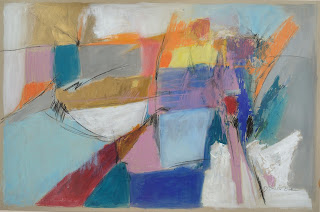
Abstract Considerations 17 Spectrum framed work on paper 32X42.by Debby Brisker Burk
For Purchase
contact: debbybriskerburk@gmail.com

The Artrainmaker blog by Debby Brisker Burk is an evolving space about all things art: ideas, inspirations, painting methods, materials,  studio views, tips on creating,  & travel experiences!

           
The painting above, Abstract Considerations 17 Spectrum began as a figurative painting and evolved to an abstract piece with the use of varying shapes, textures, directional lines and color! 
Here are some thoughts on Shape:
               "The Shape(s) of Design"

  • Shape is one of the principles of design.


  • Shapes!! What an array of choices for the artist and viewer to consider: squares, rectangles, circles, traiangles, amorphous, biomorphic, geometric, the possibilities are limitless.


  • How artists combine shapes and open or close shapes create the composition on  the picture plane. The building block of design and composition : shapes start the story in a painting or a  drawing. Shapes influence style whether symmetrical or asymetrical, loose or tight. Shapes determine relationships in space.

   So, where to start? Begin simply and add variety to create interest, harmony or discord-- all depends on what the artist is seeking to say in his or her art.

As an artist, collector or as a viewer, the shapes on the canvas or paper will speak to you, if you listen and open your eyes to what you are seeing!
  words to consider in shape making: relationship, spacing, proportion, combination, content, configuration

www.deborahbriskerburk.com; instagram: debbybriskerburk
facebook: Fine Art by Debora Brisker Burk


Wednesday, May 18, 2011

Two New Venues Exhibit Work

Not only is my work being currently on exhibit at the Har Shalom Gallery in Potomac, Maryland but is now being featured in the Philip Morton Gallery in Rehoboth, Delaware. If you get a chance to stop by, please do so.


Har Shalom Gallery
11510 Falls Road
Potomac, Maryland, 20854


solo show now through June 29


Philip Morton Gallery
47 Baltimore Ave
Rehoboth, Delaware, 19971


featured now-until July 1 and through 2011 season


Please, stay tuned for my next art tip...coming next week...!

Tuesday, May 3, 2011

Mind Tamer Meditation April 20, 2011


"Mindscape/Cool III" mixed media on paper 13"X10", unframed; 18"X 21" framed

Prepare your drawing or painting supply list: quality paper, water color crayons, colored inks, acrylic or water color paints, brushes, water containers etc.

Select and play calming music. Set timer for 10-15 minutes. Sit a in a comfortable chair with loose clothing. Close your eyes and take a deep breath. Notice the mind “chatter”. Let it be. After a few moments, focus on breathing for a few minutes: in and out. Inhale and exhale slowly. After a couple of cycles of slow breathing, return to normal breathing.

Next, imagine your very favorite spot in the world…beach or mountains or wooded landscape? Wherever it is, make it serene and put yourself in the middle of it. For example, if you are in the woods, imagine the lush forest with a babbling brook and rustling leaves. Notice the color the leaves, the rocks and the trees. Feel the gentle breeze on your skin. Taste the air. All is quiet; all is calm. Be in your special landscape. Relax and enjoy it.
When the timer goes off, slowly move your hands and feet to awaken your body. Gently open your eyes. Take another deep breath. Notice how you feel now. Get up slowly.

Go to your artist’s page with renewed serenity. Take a few moments to re imagine “your” landscape. Begin by using your drawing instruments to draw some shapes that remind you of your mind voyage. Allow the calm mood to continue to guide you.

Wednesday, April 6, 2011

Linear Expressions

Lines, dots, dashes...there are a variety of ways to articulate the surface of your artwork. Notice great art and how different artists utilize line. Think of "The Mark as a Force." The "Mark" of an artist is unique. How can you develop your own personal mark? Select your desired surface, such as quality drawing paper or canvas, and experiment with mark-making. In addition to traditional brushes, pens, pencils, and crayons, experiement with found objects: twigs, leaves, string, marbles, tennis balls, gauze, kitchen tools, pipe cleaners, etc. Try dipping the selected objects into pre-mixed paint or colored inks to see what happens. Focus on different types of marks-- strong, delicate, heavy, dashed, and dotted. Let your imagination take off to start your creative juices flowing.


Encounter. Mixed Media on Canvas, 32 x 43

Wednesday, March 23, 2011

Warms and Cools to kick start your creativity!


Select two-three hot pigments-such as : yellow, orange or red. Creat a painting with all hot colors. Use a little bit of cool (such as blue, green or purple) for relief.


Try this again with cool colors such as: blues, greys, purples and greens. Selcect two-three. Add a bit of warm/hot colors to make impact. Compare the two different art works. Is there harmony or contrast? This is another way to get inspired to foster your creativity.